Sunday, May 22, 2011

Storyboard

For my storyboard, I have decided to do my intro sequence on Hans Christian Andersens, The Shadow. A sum up of the story is that a man's shadow runs away, only to return years later with human appearance and characteristic.The style that I have chosen for my T.V series is Anime.

STORYBOARD

Here is the first scene to my intro,


  •    The setting of the scene will be in Northern Europe.
  •     The architecture will be 18th century Northern Europe.
  •     Environment will be night time with mist and heavy clouds.
  •     The moon will be dominant in brightness towards the dark environment.
The shot will open up with the camera aimed at the ground. The camera will then tilt upwards to an upward perspective of the building. There will be no movements in the shot besides the heavy clouds slowly drifting across the night sky and the moon. The duration of the shot when it is focused onto the buildings will be about 3 seconds.

By doing this, it will create a sense of mystery and mischieve. The transition into the next shot will be an overcast of darkness that sweeps across the screen until the first scene cannot be seen. Once the whole screen is engulfed by darkness, the screen will then flash white and fade out into the the next shot -


This next shot will be that the camera is panning at an incredible speed from left to right. Everything in the foreground will be blurred (a good example would be like looking out the window of a car or train, only to see everything blurred) The background (which consists of the mountains, trees, sky and moon) will be moving across the screen slowly as it is further away in the distance.

This shot is to create a sense of eagerness and excitement.

The transition into the next shot from this shot will be that this current scene fades away will the camera is still moving. As the shot is fading away, the next shot is already appearing behind the current shot.


From the previous shot of the panning scene, it will fade away into this scene. The camera will start of zoomed in at the candlelight. The trick here is that the as the previous shot is fading away, the position of the candlelight in this scene will be in the same position as the moon in the night sky.

Once the previous shot has completely faded away, the current shot will now be in full focus. Starting zoomed into the candlelight, the shot slowly zooms out to reveal a table with pens, paper, books and other stationary items. The shadow of the stationary items will be flickering due to the candlelight.

By having this shot, it is to give a clue to the protagonists characteristics (ie. intelligent) Also to enhance the importance of light to shadows - as the candlelight provides the existence to the shadows of the stationaries.

The transition into the next shot will be a sudden white flash that fades out almost instantaneously to reveal the next shot.


This shot will start out as just the protagonist standing by himself in a room of darkness. But as time passes we start to see that a greyish figure slowly appears behind him.

This shot will not be continuous, meaning we will keep coming back to this shot through out the intro sequence.

For this part of the intro, the shot will have the figure grow up to the protagonist height until it cuts into the next shot.

The transition from this shot into the next will be instant, without any special looking transition.


This next shot will be still shot, nothing will have any motion what so ever. Minimal movements will be in the current of the ocean and clouds as well as the slight movement in the protagonist hair and clothing being blown by the ocean breeze.

The point of this shot is to show isolation, however that isn't entirely true as his shadow will always be with him. The duration of this shot will be around 3-5 seconds while the intro music is playing in the background.

The transition of the next shot will again go back to the shot where the protagonist is standing in a dark room with his growing shadow.


This time his shadow would have been overwhelming him, being about 3 heads taller than him while holding an evil grin.

The shot will hold its place for around 3 seconds. Movements in this shot will be the shadow gently swaying side to side with a shadowy aura pertruding the figure.

Then once the hold has reached an estimate of about 3 seconds, the shot will zoom into the face of the protagonist. The zoom into the face will be relatively fast, once it has reached the face the zooming speed will reduce to about 70%. Then it will continue to zoom into the eyes of the protagonist until the whole screen is filled with the dark pupils of his eyes.


Now the screen should be completely black. The darkness should hold its place for about 3 seconds until the title of the series emerges from it.

The effect of the title will be that it emerges from the darkness like it is emerging from liquid. Then the moon will emerge from the darkness like a reversed eclipsed, diagrams of the appearance of the moon can be seen on the right of the image above.

Sunday, May 15, 2011

Pictogram Design Brief

The following design brief is for my course unit. We were asked to put ourselves in the role of an art director and you got these instructions from a client.

I chose topic number 2, which was Pictographic Narrative. Which was to tell a story with a sequence of images using simplified pictorial signs and symbols 


Corporate Profile
McDonald’s is the leading global foodservice retailer with more than 32,000 local restaurants serving over 64 million customers in 117 countries each day. Our business is well known for its Big Macs, Quarter Pounder and Chicken McNuggets. Our franchises are free units offering dine-ins and drive-thru’s, we have many restaurants located in airports, retail areas and high traffic locations.
Market Position
Our business is continually growing larger every day with more and more franchises being established. Our products have also become a familiarity with the majority of our customers; it is consumed at least twice a week by the same customers. We are constantly expanding the range of our products, by introducing healthier choices which is very appealing to everyone all rounds.
Project Objectives
Our idea is to expand the visual creativity of our brand by making it much more attractive. By doing this we will be able to expand and reach out to new potential customers and also to keep our existing customers interested and fascinated. We want a new look that will serve to be both attracting visually as well as having concept and theme attractiveness. We plan to associate this visual theme and concept with each individual product (burgers), in a way to promote the least attractive product in the market.
The idea is simple; in each product packaging, there will be a part of a story related to how McDonalds came to be (this concept of having readable information in the packaging is an idea that we already have in use, i.e. product information such as nutrition and meat source). The story will revolve around McDonalds famous mascots, such as Ronald McDonald, Mayor McCheese, the Hamburglar, Grimace, Birdie the Early Bird, and The Fry Kids. Each of these characters will be turned into an attractive simplified pictogram. The idea of the visual is to redesign the characters so that they look fresh and modern, but still inhabiting their original characteristics. (Basic story plot will be given)
There will be a pictogram in each packaging which will have relevant relation to that particular part of the story. The first part of the story will be presented in the “Big Mac” packaging as it is the most successful food product in our franchise, and the rest of the parts will be printed in the other product package in the popularity order. (Customers will have to had bought each individual burgers to finish the story)
Finally, to make the prints worth reading and purchasing, the pictograms on the packaging can be torn out and collected. By collecting all you will get a free meal of your choice with a limited edition plushie.
Target Audience
Our product has always been about the attraction of families with kids, but we realise that many of the kids that we used to sell our products to have grown to be young adults. Instead of creating new designs for the “Happy Meal”, we are trying to expand our brand to young teenagers, 12 - 16 years of age. The product will appeal to females generally, it will also appeal to a lot of the creative and artistic customers, due to our – yet to be – catchy visuals which is accompanied by its concept.
Project Management
The draft will be expected to be completed in a week and a half and a meet up will be arranged to decide on the final outcome. The final product will be expected two weeks after the meet up and be ready for print. The release for the promotion will be in about a month.

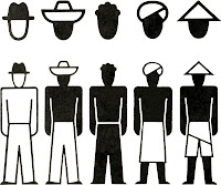
The idea of the pictogram is to basic shapes and colours (unlike having only black and white in the image to the left)

"An example of an Isotype"

Although, in our design we do still want a good sense of details such as facial attributes and environment lighting (using different tones of the given colour)


Here is a good example by what we want in our design as to not having any outlines in their figure. Note how only coloured shapes are used to make the image of the cartoon character.

*Using only colours and white space to create the image"


Here are 5 of the required design of McDonalds mascot pictogram design.

"Birdie, Ronald, Hamburglar and Grimace" Order from Left to Right

These designs have good details, although the required pictogram design is to be simple but still recognisable. *Note that figure outlines are not wanted*


This image holds some good representations of how we would like our visuals to resemble. We would like our pictograms to be made with as many curved shapes as possible without over using it. Making the head bigger than the body is also an attribute that we would like our image to have.

*Curved shapes and large head to body ration will create the sense of cute and attractiveness*


All in all, the main attribute we require is having simple pictorial representations of each mascot, but still giving the customers the visual cues to recognise each characters (mascots)


COLOUR SCHEME


Thursday, May 5, 2011

Social Conscience Assignment


For my topic on Social Conscience, I decided to do "Poverty". The poverty in my posters revolves strongly around child poverty.


The poster above is targeted towards people who are financially secured and are able to provide donation towards poverty affecting children. By using symbolism, I added a door in a middle of a dump, where a dirty baby is looking at it. In a way, they are given the opportunity to have a better life. Although, the door is locked and the key to their freedom from poverty is in our hands.


The second version for my poster is this time aimed towards the government and school. The image is of a young child sitting on a stack of books. This is a symbolism for the child having an education. Then there is the faded world of a very lovely looking park into a rubbish dump. This symbolises that anything in the perimeter of the books (EDUCATION) will be beautiful. Education is what will stop many young children to grow up to be jobless and homeless. Asking the government to provide free education to young children.


Sunday, May 1, 2011

Heart Shape in Illustrator

I learned how to use Illustrator to creat a simple hard shape. It was confusing as to figuring out how the tools work. But with help I was able to understand it's basic functions.

Steps I took were   1. Create two circles using the eclipse shape tool (L)
                               2. Create three lines that represent an upside-down triangle for the  bottom heart
                               3. Then we use Window > Pathfinder. Select shape and choose divide
                               4. Last step we use Window > Pathfinder. Select shape and choose merge
                               5. Now the outline of the shaoe should be highlighted, ready to be filled with colour.