I chose topic number 2, which was Pictographic Narrative. Which was to tell a story with a sequence of images using simplified pictorial signs and symbols
Corporate Profile
McDonald’s is the leading global foodservice retailer with more than 32,000 local restaurants serving over 64 million customers in 117 countries each day. Our business is well known for its Big Macs, Quarter Pounder and Chicken McNuggets. Our franchises are free units offering dine-ins and drive-thru’s, we have many restaurants located in airports, retail areas and high traffic locations.
Market Position
Our business is continually growing larger every day with more and more franchises being established. Our products have also become a familiarity with the majority of our customers; it is consumed at least twice a week by the same customers. We are constantly expanding the range of our products, by introducing healthier choices which is very appealing to everyone all rounds.
Project Objectives
Our idea is to expand the visual creativity of our brand by making it much more attractive. By doing this we will be able to expand and reach out to new potential customers and also to keep our existing customers interested and fascinated. We want a new look that will serve to be both attracting visually as well as having concept and theme attractiveness. We plan to associate this visual theme and concept with each individual product (burgers), in a way to promote the least attractive product in the market.
The idea is simple; in each product packaging, there will be a part of a story related to how McDonalds came to be (this concept of having readable information in the packaging is an idea that we already have in use, i.e. product information such as nutrition and meat source). The story will revolve around McDonalds famous mascots, such as Ronald McDonald, Mayor McCheese, the Hamburglar, Grimace, Birdie the Early Bird, and The Fry Kids. Each of these characters will be turned into an attractive simplified pictogram. The idea of the visual is to redesign the characters so that they look fresh and modern, but still inhabiting their original characteristics. (Basic story plot will be given)
There will be a pictogram in each packaging which will have relevant relation to that particular part of the story. The first part of the story will be presented in the “Big Mac” packaging as it is the most successful food product in our franchise, and the rest of the parts will be printed in the other product package in the popularity order. (Customers will have to had bought each individual burgers to finish the story)
Finally, to make the prints worth reading and purchasing, the pictograms on the packaging can be torn out and collected. By collecting all you will get a free meal of your choice with a limited edition plushie.
Target Audience
Our product has always been about the attraction of families with kids, but we realise that many of the kids that we used to sell our products to have grown to be young adults. Instead of creating new designs for the “Happy Meal”, we are trying to expand our brand to young teenagers, 12 - 16 years of age. The product will appeal to females generally, it will also appeal to a lot of the creative and artistic customers, due to our – yet to be – catchy visuals which is accompanied by its concept.
Project Management
The draft will be expected to be completed in a week and a half and a meet up will be arranged to decide on the final outcome. The final product will be expected two weeks after the meet up and be ready for print. The release for the promotion will be in about a month.
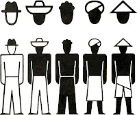
The idea of the pictogram is to basic shapes and colours (unlike having only black and white in the image to the left)
"An example of an Isotype"
Although, in our design we do still want a good sense of details such as facial attributes and environment lighting (using different tones of the given colour)
 Here is a good example by what we want in our design as to not having any outlines in their figure. Note how only coloured shapes are used to make the image of the cartoon character.
 *Using only colours and white space to create the image"
 Here are 5 of the required design of McDonalds mascot pictogram design.
"Birdie, Ronald, Hamburglar and Grimace" Order from Left to Right
These designs have good details, although the required pictogram design is to be simple but still recognisable. *Note that figure outlines are not wanted*
This image holds some good representations of how we would like our visuals to resemble. We would like our pictograms to be made with as many curved shapes as possible without over using it. Making the head bigger than the body is also an attribute that we would like our image to have.
*Curved shapes and large head to body ration will create the sense of cute and attractiveness*
All in all, the main attribute we require is having simple pictorial representations of each mascot, but still giving the customers the visual cues to recognise each characters (mascots)
COLOUR SCHEME


No comments:
Post a Comment